I praise Chloé as a Brand because of its french origin with beautiful collections segmented for young girls and carefully chosen selective materials for making the range.
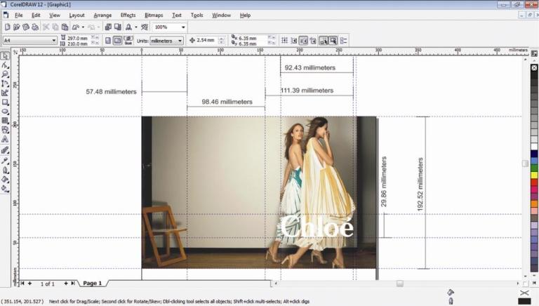
This time Glen Luchford (webiste http://www.glenluchford.com/) the photographer of SS12 campaign not just created an amazing art work but represented the brand in its true glory. The campaign for spring summer is simple yet effective, chic yet edgy but these are few obvious and very general observations. However the grid and layout played an integral and silent role in making it a master piece and here is how i tried to decode the same.
Chloé typo overlapping on the models makes it content effective as it allows the eyes to look the fashion figures and recall the brand name simultaneously. This campaign is a good mixture of typography, Object + Context understanding , precise Spring Summer orientation, color coordinated, acute layout and right posture of models.


