

I admire CP as a brand for its authentic approach towards product designing, marketing access and sales platform. However, this visit report is based on my own understanding & observations about the brand’s presentation, visual strategies & communication. This report does not oppose or claim that any of the ongoing campaign and display methodologies are unauthentic or right or wrong rather it explains the areas which I believe should be improvised, modified, minified, combined, and rearranged for better product visibility.
Thoughts on Window Display:
Window Display is the face of a store and Visual merchandisers are the make-up artist for its beautification. Hence, it is important that window should communicate simple yet effective, chic yet starry message to the customers. It should be clutter free and expressive as a composition. Therefore my statement and observation on the current set-up also delineates that it should appear more authentic in its overall presentation than an adaptation or extended version of international versions or displays. Text in the windows (Rhapsody to Blue) should be clearer and jargon free. For example a tinted yellow shirt should not be displayed in a blue story window. I have asked few customers if they could relate the story with display and surprisingly most of the customers ended up with ambiguous explanations like repeat blue in your wardrobe, find happiness in blue color. I believe Rhapsody is an ode to blue.

Depth of the window could have been used in an effective ways to announce the availability of collections or widened product features.
Idea: Use oversized props like a shirt in the form of accordion showcasing the depth of merchandise within, remove mannequins, make product a hero, less of text more of objects/ props. Text creates limit and object initiates the thought process.
Brand’s design philosophy; a frame which is just behind the window and right side of the entrance is not placed at a comfortable and readable zone. It should be installed at some other area where it would add more value.
A mannequin adds dynamism to the static zones and makes the store environment looks alive. A lot many innovations are happening in the domain of mannequin design and productions. I believe brand should incorporate expressive mannequins with outstanding gestures.
Thoughts on In-store presentation:
Nesting table presentation should be synchronized with window display for better customer service and product discovery. It should have blue color shirts and other associated products displayed on it since a customer cannot touch and see the product from window and he would only have nesting table as another tool of getting introduced to the collection.

Idea: Artwork integration on the nesting tables announcing the core purpose of collection. A set of two bust to be placed on the nesting table to increase the visibility. There are many ways to present the collection on nesting tables. Less of stacks more product spread is essential.
Wall plan-o-gram could have been revised with the spread of the collection in an appealing method. It is also very difficult to demarcate one wardrobe presentation from another.
Idea: Change of Wall configurations and wall plans to showcase the depth of the collection, add Visuals above the merchandise walls would add the attractiveness and increase the chances of better clarity on the overall theme and product presentation. Novelty & distinguished props to be placed within the walls to create a better impact and translate the collection.


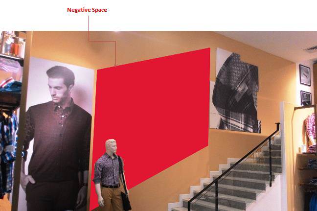
Mezzanine floor adds up aesthetics in overall construction of the store and also fulfills the regulations of local municipal authorities design needs (since all the brands are supposed to have mezzanine floor for security reasons). But a question should be raised here that why should a customer go upstairs? What are the different offerings? Are walk-ins of the stores matching with the walk-ins of mezzanine floor entry? And is the visual appeal of mezzanine floor so amazing that no customer can leave the store without entering respective floor? I strongly believe that through the visual engagement brand can make this possible. At present wall adjacent to staircase looks empty and mezzanine floor does not looks seductive at all. Hence special treatment is required.
Style quotient was missing from the presentation tables. There is a need of light installations within the furniture to increase the visibility.

Thoughts on Product Placements:
All the shirts were folded in the same way however every shirt is not of the same GSM or properties and hence stack height is not poised. Every garment should be folded as per its very own structure. A rigorous training on brand presentation and its specialization could help retail fronts to present the collection in precise and tuned manner. Moreover, A4 size executive sheets are used for folding purposes whereas the packaging material which comes along with it goes for waste. Certain folding techniques can stop the misusage of available resources and increase the brand presentation appeal as well.
Zoning is pivotal in retail front however a clear demarcation was missing throughout the store. Customer should feel delighted on the discovery and should browse by controlled process which are designed and strategized by VM integrations. A trouser wall, Shirt bar, half sleeves shirts zoning should become compulsory elements and display walls.
A customer is Facebook, Twitter and LinkedIn oriented and these platforms have impacted on their thought-patterns, visualization and navigation behaviors and hence brand needs to upgrade their in-store experiences with better story integration. Colorplus is 20 years old brand
and customer wants to see the story threads in the form of visuals, literature and interactive tools. As of now all these elements are missing from the store.
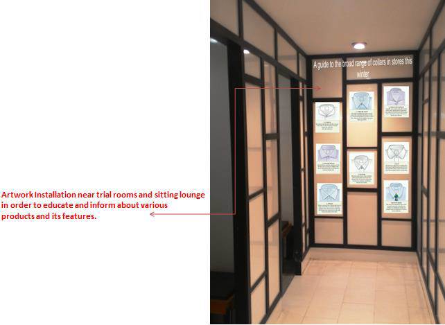
Information and education goes hand in hand. Merchandise should not be sold on the basis of customers understanding rather projected as need of the time. I believe there should be a special zone dedicated for this very special purpose to announce the various detailing and purpose of collars, buttons, cuffs etc.

